

Best CV Format for Job Applications in 2026
Stop using layouts that confuse hiring managers. We show you the exact margins, fonts, and structures that pass automated screening filters and land interviews. Ensure your layout is 100% ATS-compatible to bypass the automated filters.
Table of Contents
Why Your Layout Beats Your Font
"A professional CV format isn't about decorative graphics. It's about ensuring a recruiter finds your best skills and achievements instantly."
The Format Success Plan
There are three primary ways to structure your CV. Selecting the correct one depends entirely on your industry and career experience.
Reverse-Chronological (The Industry Standard)
This is the default CV format for jobs and is preferred by 90% of employers. It lists your newest experience first and flows backward. It is highly effective because it shows your career progression, growth, and continuous tenure clearly. Ideal for anyone with a steady, traditional work history in fields like finance, healthcare, tech, and operations.
Master the top section with our summary examples.
The Hybrid Layout (Skills + Work History)
An excellent CV format for experienced professionals who are shifting careers or bridging employment gaps. It places a comprehensive 'Summary of Skills' at the very top of the page, with a condensed reverse-chronological work history below. This allows you to highlight relevant transferable skills and achievements first, while still providing traditional chronological proof of employment.
Functional (The Red Flag Layout)
This format groups your experience strictly by skills, completely removing or downplaying dates. Warning: Most recruiters strongly dislike functional layouts because they make it look like you are hiding employment gaps, job-hopping, or a lack of tenure. Only use this if you are completely fresh to the market or have no related work experience.
How to Format Your CV Step by Step
A practical guide to setting up your document from scratch for maximum readability.
Set Your Margins
Ensure your document margins are set to 1 inch on all four sides. If you need slightly more space to fit your experience, you can reduce them to a minimum of 0.75 inches, but never go narrower. This keeps the layout balanced and prevents crowded margins.
Choose a Professional Font
Use clean, modern Sans-Serif fonts like Arial, Helvetica, or Roboto for excellent screen reading. Set your body text size to 10-12pt and make your section headers larger, around 14-16pt and bold, to establish a clear hierarchy.
Structure Your Chronological Grid
For each work experience entry, use a standard layout: Job Title (bolded), Company Name (regular/italicized), and Dates Employed aligned to the right margin. Use bullet points rather than paragraphs to list your accomplishments.
Format Your Bullet Points
Keep bullet points to 1-2 lines maximum. Start each bullet with a strong action verb (e.g., 'Led', 'Developed', 'Optimized') and focus on quantifiable achievements rather than generic duties (e.g., 'Increased sales by 15%').
Save as a Searchable PDF
Always save your finalized document as a text-searchable PDF. Try highlighting and copying text from your exported PDF to ensure it is not saved as a flat image, which screening software cannot read.
CV Format by Country
Different countries have distinct expectations for what belongs on a professional resume. Here is how formatting rules vary internationally.
United States & Canada
Standard 1-2 page Resume is expected. Avoid photos, personal details (such as age, nationality, or marital status) due to strict anti-discrimination laws.
United Kingdom & Ireland
Use a clean 2-page CV format. Photos are not accepted. Place your personal summary at the top, followed by reverse-chronological experience.
Gulf Region & Middle East
A professional headshot is frequently expected, along with nationality, visa status, and monthly salary package expectations in the header.
Australia & New Zealand
Detailed 2-3 page CV format is common. Keep photos off the page, and focus heavily on details of career achievements and local references.
The 1-Page vs. 2-Page Standard
If you have less than 5 years of experience, or are using a CV format for freshers, stick to one page. If you are an experienced professional with a decade of results, two pages is the professional standard. Never go to three pages unless you are in a highly specialized academic or scientific research role.
Stop trying to cram ten years of hard work onto a single page. Follow this simple career threshold rule.
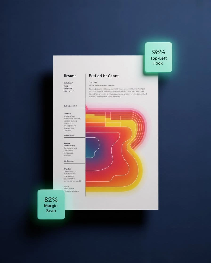
Eye fixation patterns show strongest attention on the current job title, skills block, and consistent date alignments.
How Recruiters Read
Understanding recruiter reading habits helps you position your most important achievements where they get noticed first. Our research into common CV mistakes reveals how layout directly impacts interview rates.
Primary Focus
Recruiters check your most recent job title first to gauge your alignment with the role.
Logical Flow
Aligning dates on the right ensures a smooth timeline review.
Quick Navigation
Using bold, distinct headers lets managers skip to relevant sections.
Modern Hiring Rules
Optimizing your document structure for modern recruiters and screening platforms.
Standard Reading Habits
Avoid formatting mistakes that kill conversion.
The 1-Inch Margin Guideline
Screen-Friendly Fonts
Visual Format Audit
A visual comparison of common layout errors versus professional standards.
The 'Graphic' Fail
- Multiple columns that scramble the reading order for automated screeners.
- Graphic skill meters, rating bars, or icons that cannot be read by machines.
- Tiny fonts (under 9pt) that require magnifying on mobile screens.
- Saving the document as a flat .JPG image instead of a text-searchable file.
- Cluttered backgrounds or colored shapes that disrupt layout flow.
The 'Pro' Format
- Single-column layout for reliable scanning accuracy.
- Clean, black text on a crisp white background.
- 10-12pt font sizes for easy reading on all device screens.
- Consistent right-aligned dates for an easy-to-scan timeline.
- Saved as a high-quality, text-searchable PDF.

Format Guidelines
Modern screening software operates best when your document maintains a clean linear layout, standard Margins, and standard system fonts.
Font and Spacing Rules
Proper formatting is about maintaining visual comfort and helping hiring managers read your accomplishments smoothly.
Standard Line Spacing
Sans-Serif Font Families
Standard Gutter Boundaries
Best Format for You
Match your career stage to the recommended structure to display your qualifications in the best possible light.
The Rising Professional
Recommended Format:Reverse-Chronological
The Career Changer
Recommended Format:The Hybrid Layout
The Senior Leader
Recommended Format:Reverse-Chronological (2-Page)
The New Graduate / Entry Level
Recommended Format:Reverse-Chronological (1-Page)
Standard Section Architecture
The precise order of sections expected in modern layouts. Learn more about choosing skills for your CV.
1. The Header
2. The Profile Summary
3. Professional Experience
4. Skills & Tech Stack
How ATS Reads Your CV
Ensure your document matches the expectations of screening algorithms by maintaining clean, standard layout elements. Ensure your document passes the ATS technical audit by following these machine-vision rules.
Margin Standard
Font Stack
Reading Order
The Final Recruiter Audit
Perform these 5 quick checks before sending your application.
CV Format FAQ
Executive Toolkit
Build Your Professional CV for Free
Pick from 30+ board-ready designs and establish your leadership in minutes. 100% Free.
Cover Letter Maker
Professional matching correspondence. Build for Free.
Business Card Maker
Sleek, modern designs for authority branding. 100% Free.
100% Free • No Credit Card • No Watermarks • Instant Access
Establishment Research
Continue Your Research
Explore the high-authority guides required to build the perfect CV.
CV Skills Guide
Stop listing 'Communication.' Here's what recruiters actually scan for — with proven examples by industry and experience level.
Gulf Jobs CV
Passport-ready photo, clear visa status, and GCC eligibility. The Gulf CV follows strict regional rules—here is the exact 2026 blueprint.
Canada Jobs CV
Canadian CVs follow strict privacy rules. No photo, no age, no SIN. Learn the reverse-chronological format Toronto employers actually expect.