

Critical Alert
"The Reputation-Loss Mistake"
The single most expensive business card mistake in 2026 is Pixelated Graphics from using web-resolution logos (72 DPI). This immediately signals to the recipient that your business is amateur and lacks attention to detail. Always use vector-based assets (.SVG or .AI) to ensure 300+ DPI crispness on high-end printing presses.
Reputation Devaluation Factors
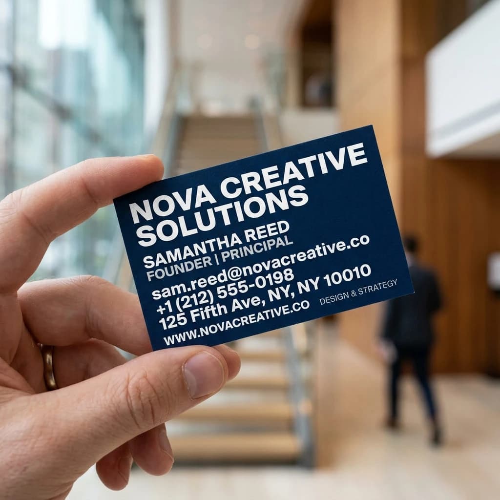
A business card is a physical artifact of your brand. In a high-stakes meeting, it is the only piece of you that stays in the room after you leave. If that artifact is flimsy, cluttered, or technically flawed, it actively erodes the authority you built during the conversation.

"The most expensive business card is the one that gets thrown away. We have identified 14 technical failures that drive your ROI to zero."
Category 1: Technical Production
Production Anti-Patterns
1. The 12pt Economy Trap
Many small business owners choose 'Economy' printing to save $30. The result is a 12pt card that feels like a flyer. This signals a temporary business state. In high-stakes consulting, this can lose you a $50k contract over a $30 saving.
Authority Fix: Upgrade to 16pt or 18pt Triple-Layer stock to ensure a rigid trust signal.
2. Missing Bleed Lines
Placing text within 3mm of the edge. Digital cutters have a 'Cut Tolerance.' If your design does not have a 3.175mm bleed, you risk uneven borders or, worse, having your phone number partially trimmed off.
Authority Fix: Design with a 0.125-inch bleed and keep all text in the 'Safe Zone'.
3. Low-Resolution Pixelation
Using a JPG logo from your website. Printed media requires 300 DPI (Dots Per Inch). Anything less looks blurry and 'dirty' on paper. This signals a lack of technical competence.
Authority Fix: Use .SVG, .AI, or .EPS vector files for every design element.
Design Authority Killers
4. Information Cramming
Attempting to turn a 3.5-inch card into a product brochure. This creates a wall of text that obscures your primary identity. If they have to search for your name, the design has failed its primary objective.
5. Low Contrast Palettes
Grey on light blue, or white on light green. If the contrast ratio is under 4.5:1, the card is unreadable in low-light networking environments like conference halls or bars.
6. Font Overload
Using three or more fonts signals a lack of brand discipline. It creates a 'shouting' effect where no single piece of information is prioritized. Stick to one font family with multiple weights.
Category 3: Strategic Missteps
Strategic Blindspots
7. No Specific Call-to-Action
Listing info without a reason to reach out. A card without a CTA is a passive artifact that relies on the recipient's memory.
Authority Fix: "Call for a free audit" or "Visit for a 10% first-time discount."
8. Generic Email Addresses
Using @gmail.com or @outlook.com for professional services. This signals a 'Side-Hustle' mentality. In 2026, a custom domain is a non-negotiable trust requirement.
Authority Fix: Use hello@yourdomain.com to build instant authority.
9. Empty Reverse Side
Leaving 50% of your real estate blank. The back of the card is the perfect place for a QR code or a list of core authority metrics.
The Elite Audit Protocol
Mistake 10: Outdated Data
Handing out cards with a 'crossed out' phone number. This signals disorganization and lack of resources.
Mistake 11: No Digital Bridge
Failing to include a QR code. You are forcing the recipient to manual-type your URL. Friction kills conversion.
Mistake 12: Poor Card Storage
Handing out dog-eared or dirty cards. This signals that you do not value your own brand.
Mistake 13: Industry Mismatch
Using a 'fun' card in a 'serious' industry. Design must match the gravity of the transaction.
Expert Final Audit
At SmartCV, we have audited thousands of career identities. The most common thread among underpaid professionals is a fragmented brand. They have a great LinkedIn, a decent CV, but a business card that looks like it was printed in a rush.
Your business card is the physical anchor of your authority. If you are serious about your career, you cannot afford Mistake 14: Skipping the Test Run. Always order a small batch of 25 cards first. Check the alignment, the color accuracy in natural light, and the QR code's scannability before committing to a full run.
Mistakes Strategic Q&A
Is it ever okay to use a generic QR code generator?
Only if you verify the link is permanent. Many free 'Dynamic' generators expire after 30 days. For an Elite card, use a custom-branded domain link or a static VCF file to ensure your digital bridge never breaks.
What should I do with 500 cards if I change my phone number?
Destroy them. Handing out a card with a handwritten correction is a massive 'Attention to Detail' failure. It signals that you are either struggling financially or disorganized. Batch your orders in 250s to minimize this risk.
Should I list my home address if I work remotely?
Never. For remote professionals, a physical address is redundant and a privacy risk. Instead, use that space for a high-value CTA or a link to your digital portfolio. Authority is about relevance, not filler.
Build Your Elite Brand
Use our professional CV and identity tools to ensure every part of your brand signals absolute authority.
Build My CV Now →